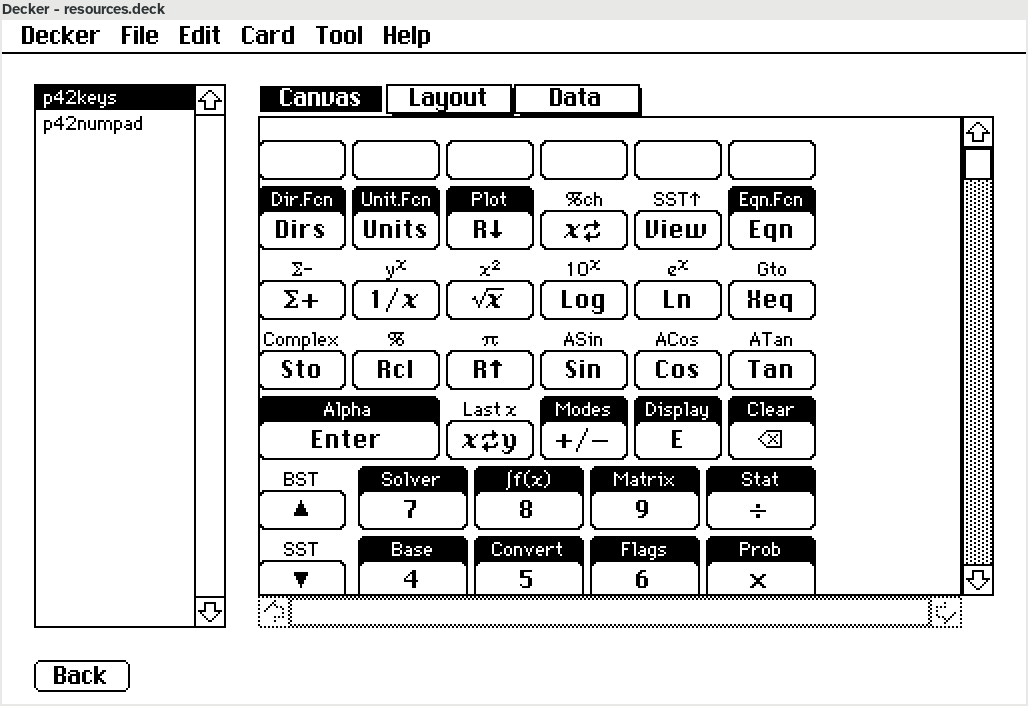
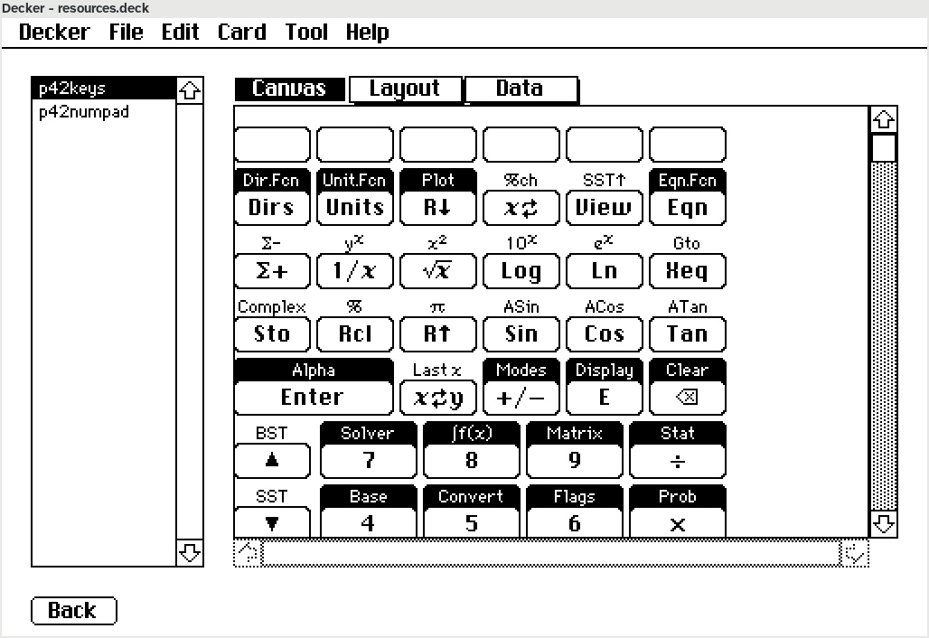
Turns out that in #Decker a font has a "space" value that controls how many pixels are left between each character. If you ask Decker to measure the dimensions of the string "zzz", you'll get a width that is three times the width of the "z" glyph, plus three times the "space" value. If you are assembling a line of text, that's great - you'll wind up with even spacing no matter how many chunks the text is broken into. On the other hand, if you are trying to render a short label, the extra spacing can be an appreciable proportion of the total length. If you're trying to *centre* the label, that extra width makes everything subtly unbalanced.
So now whenever I measure text, I take care to subtract the font space value from the result.
I think there's still some source of unevenness I haven't ironed out; the "View" button on the second row still looks a bit odd. But if you flip between these images and look at the "7" key, you'll see the newer one looks better.