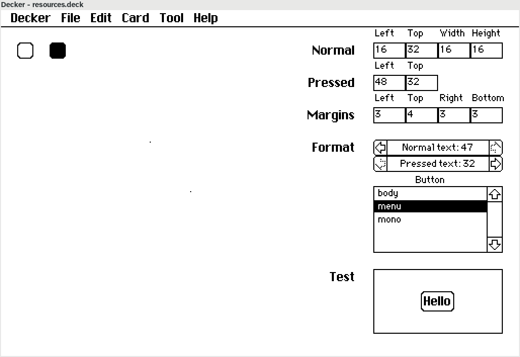

On the right are a bunch of fields - the "Normal" fields describe the size and location (on the card background) of the "normal" image of the button; the "Pressed" fields describe the location of the "pressed" image (it's assumed to be the same size). Below that, we have margins around the button that describe which parts of the image can be stretched to fit around the text that must fit within it. Then formatting: text on a normal button is rendered in colour 47 (black) while text on a pressed button will be color 32 (white), and the button label should be drawn with the "menu" font.
At the very bottom, the "Test" pane shows the resulting button drawn around the text "Hello". Whenever I change any field on the right, the test pane redraws to take my changes into account, so I can very quickly tweak all the settings to get to a button I like. The actual button drawing is in a separate function so I can re-use it to render the entire Plus42 skin later.